Three words that sit on the Mission Viejo FC website say more about this organization than most clubs manage in a paragraph.
MVFC is not a franchise. It is not a branded program dropped into a zip code. It is a family-run football club that has served Mission Viejo, Ladera Ranch, Rancho Santa Margarita, and the surrounding communities of southern Orange County for years, built on a commitment to quality, relationship, and doing things properly.
They know what doing things properly feels like. Because they also know what it feels like when things are done the wrong way.
01 · The return
Coming back felt like home.
Mission Viejo FC had been an Admiral club for many years. The relationship worked because it was built on more than a contract, it was built on a shared understanding of what quality looks like, and what it feels like to work with people who actually care about getting it right.
A couple of years ago, the club joined a larger national club program. The association required them to leave Admiral and wear another brand. It was not a decision taken lightly, and it was one they quickly came to regret. The service was not the same. The quality was not the same. Lead times stretched. Prices climbed. The promises that had drawn them into the national program did not materialize in the way they had been presented.
When MVFC made the decision to separate from the national organization, the call back to Admiral was not a deliberation. It was an instinct. They came straight back.
“We had a relationship with Admiral for a long time, and we know what the brand stands for. When we were with another supplier, the experience just wasn't the same: the service, the quality, the turnaround. Coming back felt like coming home.”Roger Castle Sr. · Director, Mission Viejo FC
02 · The lion and the city
Built in the California sun.
Mission Viejo sits in the southern reaches of Orange County, California, one of the most planned, purposeful, and community-focused cities in the United States. Named after the historic Rancho Mission Viejo Spanish land grant, it is a city that prizes quality of life above almost everything else. High standards, strong community, a climate that invites outdoor activity year-round. The families that choose to raise their children here expect the best of everything, including the football club that represents them.
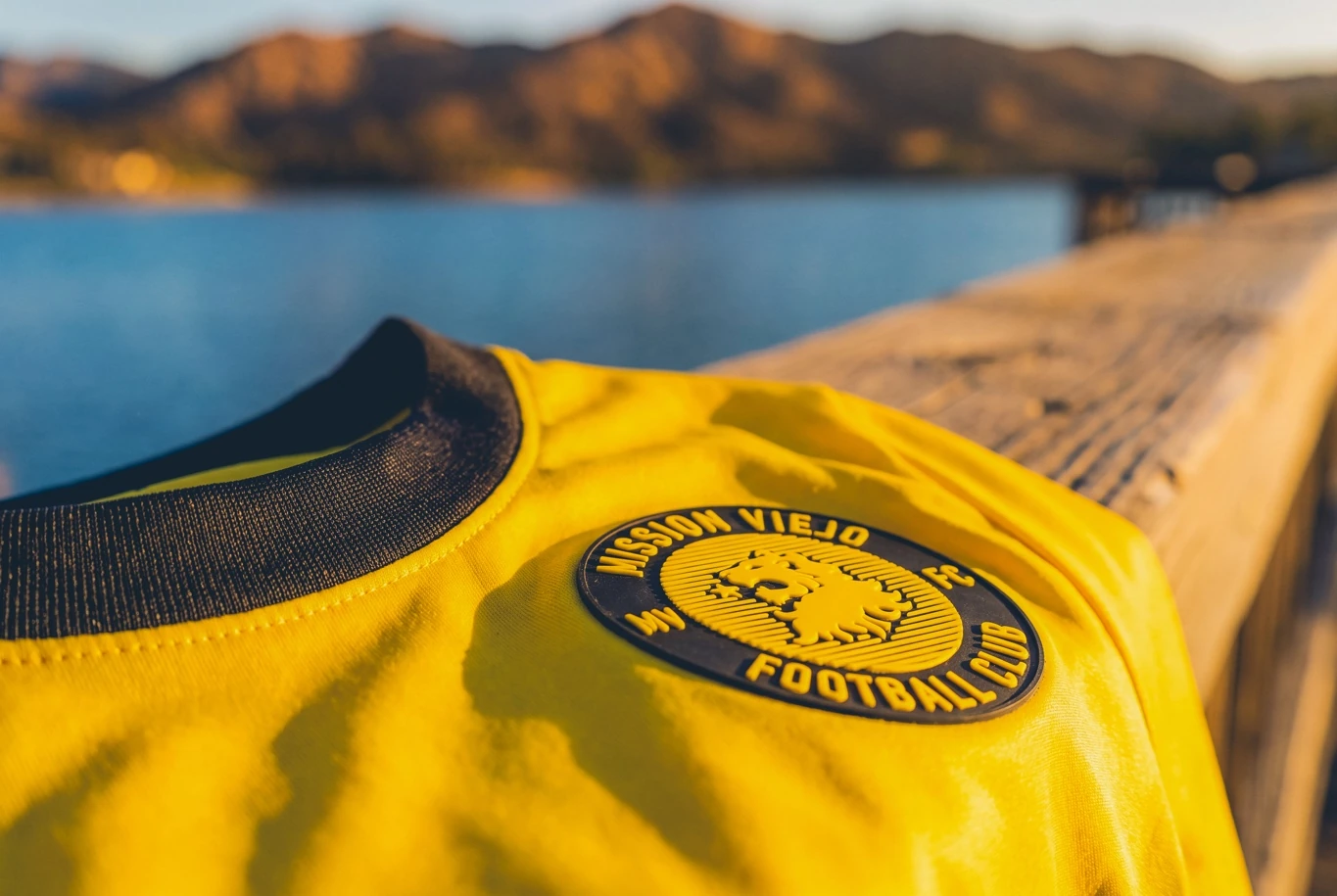
The MVFC crest captures that identity in a single image. At its center, a roaring lion rendered in gold on black, mane flowing, head raised, a star above it. The lion is the universal emblem of courage and excellence. The star marks ambition. The gold speaks to California sunshine, to achievement, to the warmth of a community that shows up. The circular badge that frames it carries “Mission Viejo Football Club” in gold type, “MV” and “FC” flanking the lion like pillars.
Every element of the new Admiral kit is a direct extension of that crest. This is not a collection where the badge was added at the end. The badge is where the design began.
03 · The match collection
Daylight. After dark.
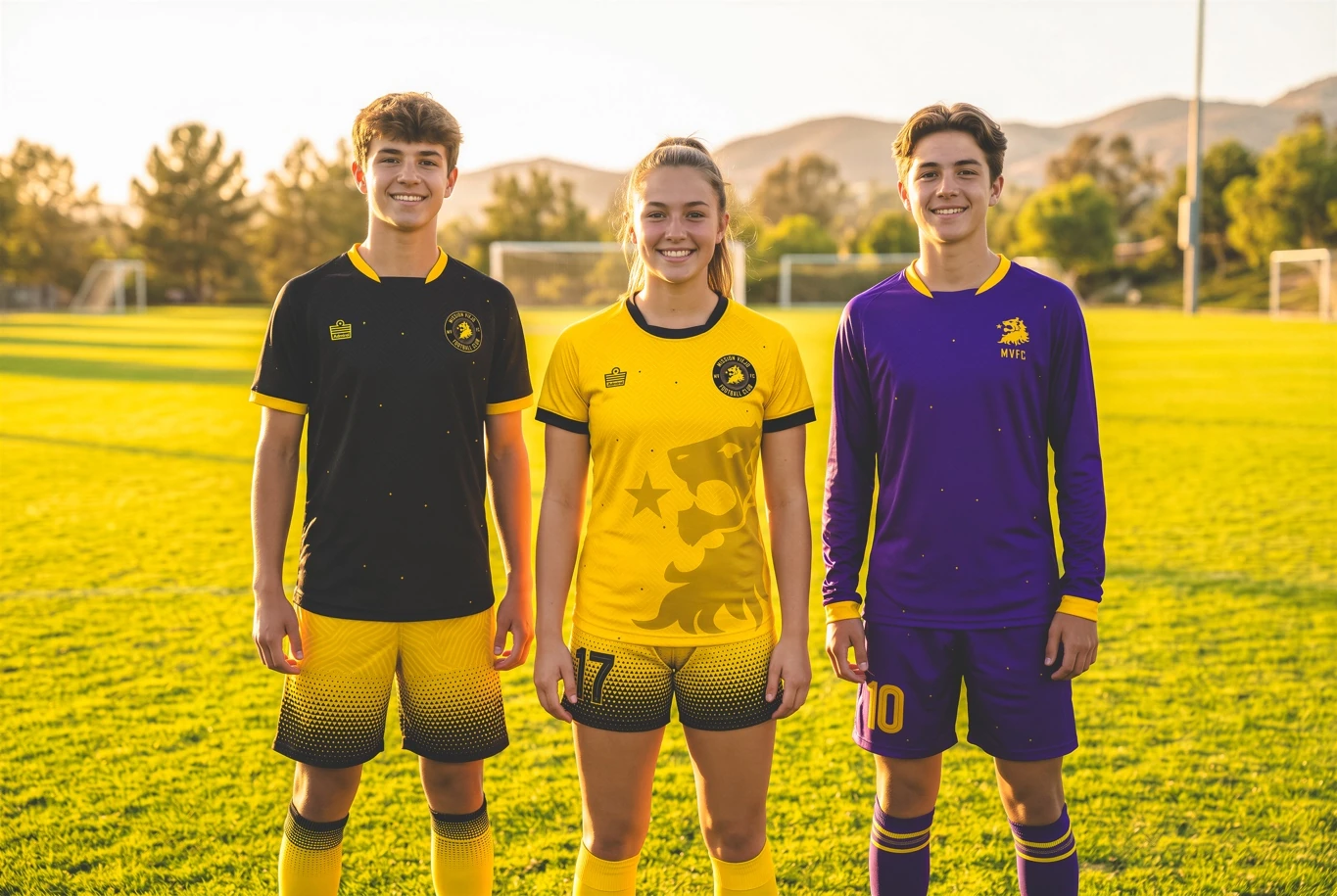
One identity, shaped across home, away, goalkeeper, and women's fits.
01 · Home kit
California Gold
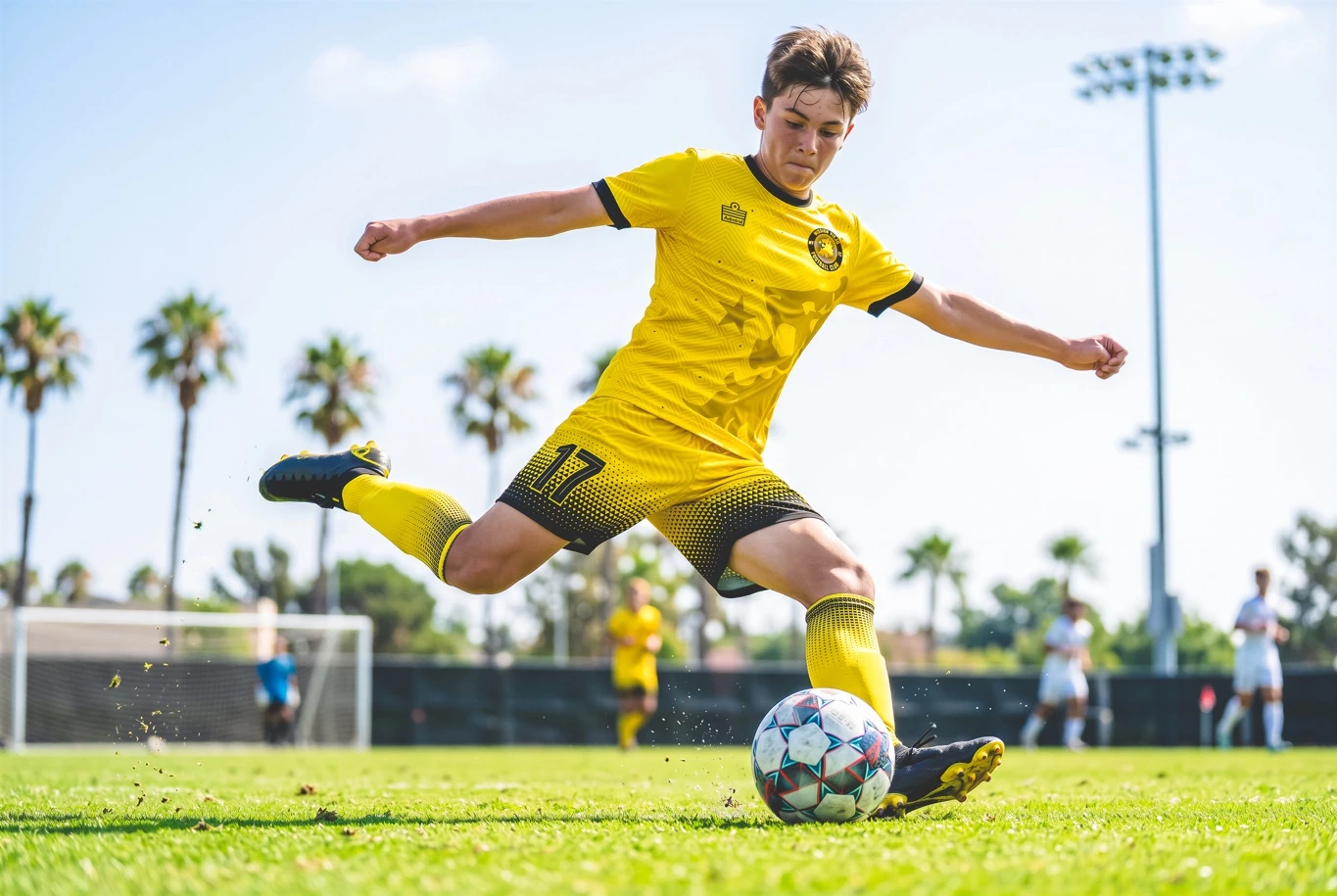
The home kit arrives in the full, uncompromising gold that the MVFC crest demands. Not a soft amber, not a muted yellow gold. The color of the California sun at noon, the color of achievement, the color that has defined this club's identity since its founding.
The design's masterstroke is the lion. Across the entire front of the home jersey, the club's lion appears as a large tonal watermark, rendered in a slightly deeper shade of gold against the body of the shirt, the roaring head rising from the right hip toward the left shoulder, mane spreading across the chest. It is subtle enough to read as texture from a distance, and unmistakable up close. A star sits above the lion on the jersey body just as it does on the crest. The effect is a shirt that wears its identity without shouting it.
Black collar and black cuff trim complete the look, a clean contrast that anchors the gold without fighting it. The shorts and socks run in the same gold, with a halftone dot pattern that fades from gold into black at the hem, a touch of technical sophistication that adds depth to what could easily have been a flat, single-color kit. Crimson accents appear subtly at the collar and cuffs, the third color from the club palette completing the triangle.
What makes this kit exceptional is that Roger Castle Junior designed it himself, using Admiral ID. Not a brief sent to a designer. Not a template selected from a catalogue. The director of the club sat down with the Admiral ID platform and built this kit from scratch, and the result is a home jersey that knows exactly what it wants to say.
02 · Away kit
After Dark
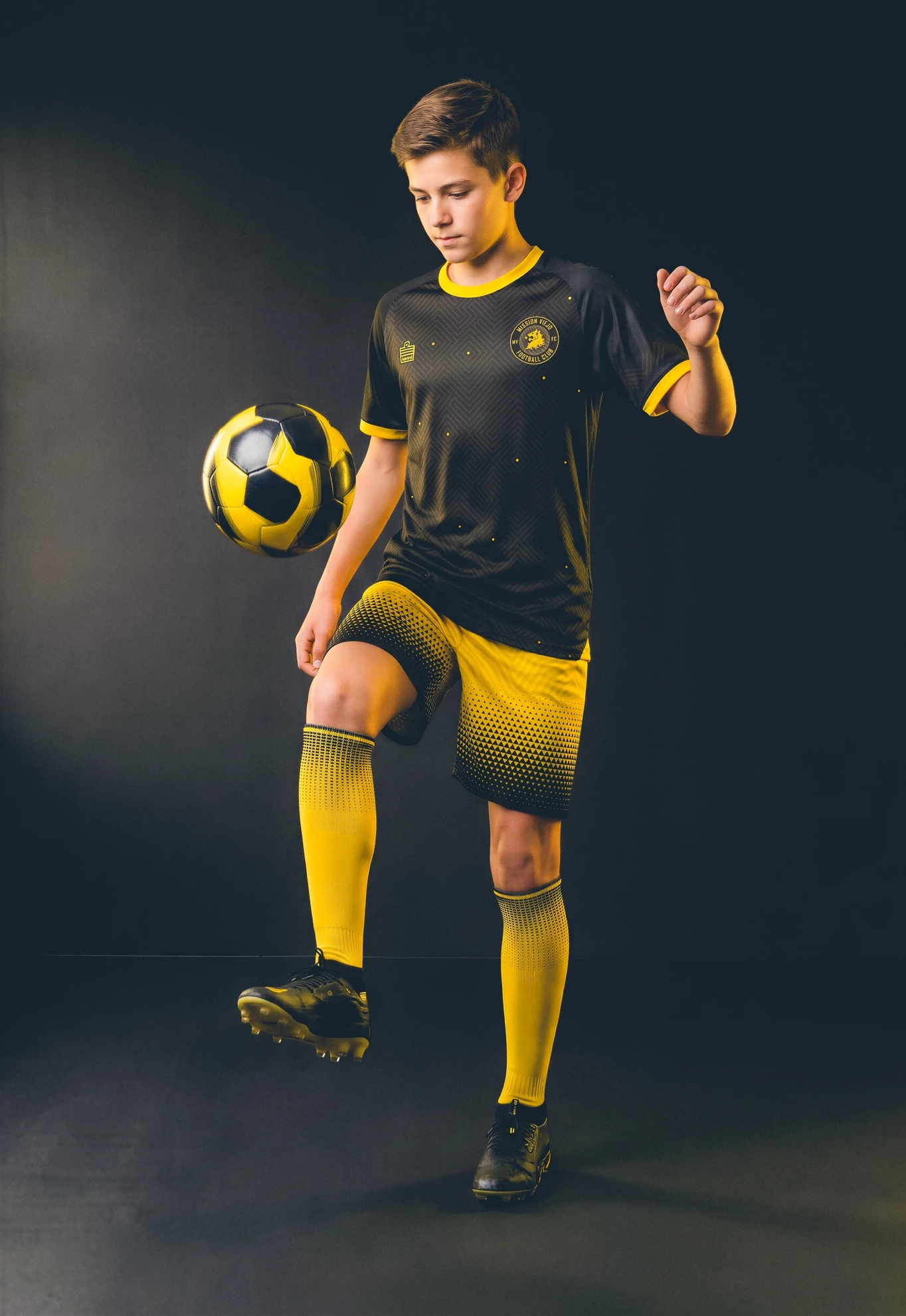
If the home kit is the California sun, the away kit is what happens after it goes down. Black, deep, total, uncompromising, covers the body of the away jersey. But it is not a simple inversion of the home. The away kit is its own statement.
From the upper chest and shoulders, an explosion of crimson and gold erupts across the black. The lion returns here, not as a serene watermark but as an energy, a burst of color that looks like the moment before a roar. Deep wine-crimson, scattered like fire embers or like the texture of a mane catching the last light, spreads across the chest and shoulders in an abstract, organic pattern. Gold dots are scattered through the darkness like stars above a California hillside.
The collar and cuff trim arrive in gold, flipping the home kit's detail colors and creating a family resemblance without mimicking. The shorts switch to gold, carrying the halftone fade from the home kit across both kits, tying the full collection together. The socks run in gold with the same dot-fade treatment. In the dark colors of the away jersey, the crest pops brilliantly from the chest.
Home and away, tied together by gold and the halftone finish.
04 · The GK kit
Regal colors.
The GK kit follows the same design as the away kit but in the colors of royalty: purple and gold.
Purple body · Gold details
Two goalkeeper colorways, one unmistakable club identity.
05 · Training in style
The quarter-zip.
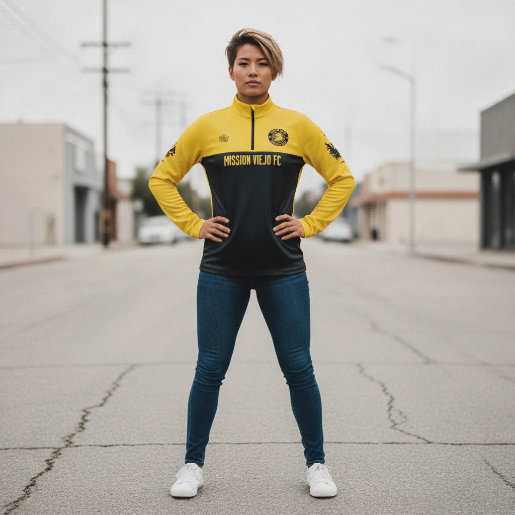
The training collection anchors the full MVFC Admiral range. The quarter-zip jacket divides itself boldly across the chest: the upper half, collar, and sleeves in gold; the lower body in black, carrying the same crimson lion-burst pattern from the away jersey. “MISSION VIEJO FC” runs across the chest in a black-on-gold band that gives the jacket a premium, club-identifiable finish. The MVFC lion appears on the sleeve in black, with “MV FC” lettered below it. The Admiral badge sits at the left chest.
On the sideline, on the walk to training, worn over a kit at a tournament, this quarter zip announces Mission Viejo FC with the same conviction as the match kits. It is a piece that gives parents, supporters, and coaching staff a way to carry the club identity into every moment, not just match day.
06 · Designed by the club, built by Admiral
Roger's vision. Built by Admiral.
One of the most significant parts of the MVFC story is how these kits came to exist. Roger Castle Junior designed them himself. Not with outside help. Not by choosing from a standard template. He sat with the Admiral ID platform and built the collection from the ground up, placing the lion watermark, choosing the halftone fade, selecting the crimson burst, deciding where the gold trim should go and where the black should start.
Admiral ID is a genuine design tool, not a decoration engine. It gives coaches, club directors, and administrators the ability to create exactly the kit they have in mind, to see it in real time, adjust it, and know that what they order is what they will receive. For a family-run club where the director has a clear vision of what the club should look like, that matters enormously.
“With Admiral ID I could see exactly what the kit was going to look like as I designed it. There's no guessing, no waiting for a sample to tell you something was wrong. You design it, you approve it, you order it. It's genuinely that straightforward.”Roger Castle Junior · Director, Mission Viejo FC
The online ordering process that follows design is equally direct. Families and players can order individually through the club's Admiral web store, selecting their sizes and customization options without the club having to collect orders, chase payments, or manage a bulk order process. For a family running a club, a husband, a wife, a son, removing that administrative burden is not a small thing. It is time returned.
07 · The women's kit
Designed for the player.
One of the clearest signs that Mission Viejo FC takes all its players equally seriously is the fact that the women's kit is a genuine women's cut, not a shrunken version of the men's jersey, not a size adjustment, but a design built for the female body.
Admiral's women's fit offers a tailored cut that is comfortable, functional, and specifically engineered for female players. For a club that fields women's teams, offering a proper women's fit changes the experience of wearing the kit, and signals to those players that they are not an afterthought. The home and away designs are identical in color and pattern across men's and women's ranges, but each is made in the cut appropriate to the player wearing it.
This is what quality looks like when it runs all the way through a program.
Women's fit · Home
08 · Why MVFC recommends Admiral
A comparison that went one way.
Mission Viejo FC has now been on both sides of the comparison. They know what it is like to work with Admiral, and they know what it is like to work without them. Their recommendation comes from that experience directly, not from loyalty to a logo, but from a comparison that only went one way.
“We tried something else. We know what the difference looks like. The quality, the service, the way Admiral actually responds when you need something, it's not close. We would not hesitate to recommend Admiral to any club looking for a real partner.”Roger Castle Sr. · Director, Mission Viejo FC
For a family club, one where the director, his wife, and his son all carry the organization on their shoulders, having a supplier that functions as a genuine partner rather than a vendor is not optional. It is essential. Admiral understands what clubs need because Admiral has been supplying clubs at every level of American soccer for decades. That institutional knowledge, that reliability, and that commitment to getting the kit right is exactly what brought Mission Viejo FC back.
Mission Viejo FC × Admiral
One club. One family. One mission.
The full Mission Viejo FC Admiral collection is available now through the club's official Admiral web store.