Where the Rivers Meet | Charleston City FC × Admiral

Admiral Journal · Charleston City FC

Charleston, South Carolina · March 2026

Where the
rivers meet.

A collection drawn from the waters that made the Lowcountry.

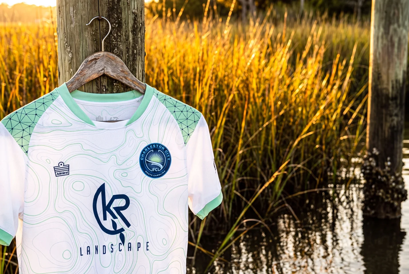
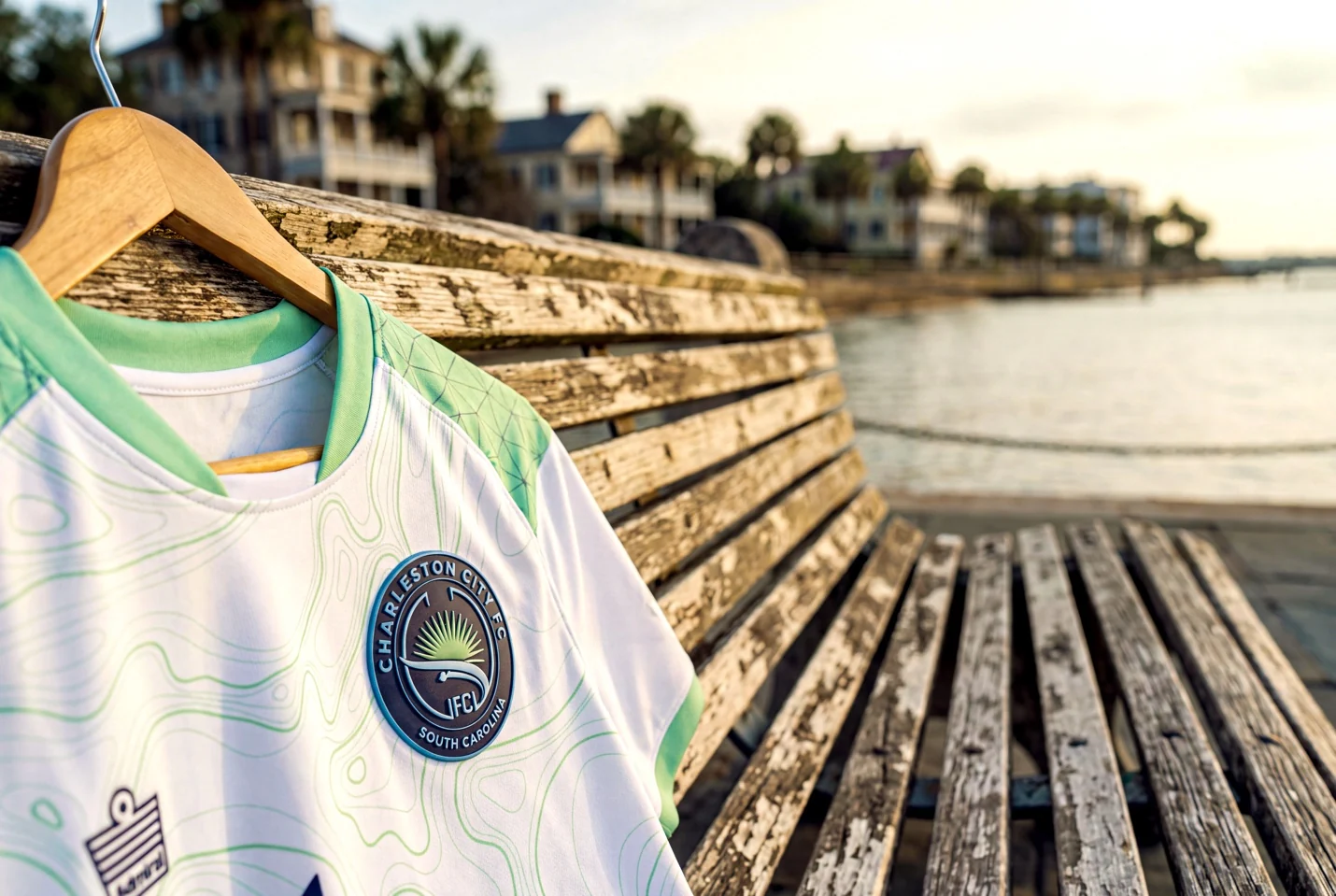
Charleston City FC white and teal jersey beside the water
Three rivers.
One harbor.
One city.

Charleston is a city made by water.

The Ashley, Cooper, and Wando do more than shape the map. They shape the club.

Charleston City FC’s 2026 Admiral collection begins where those waterways converge. The design moves past postcard imagery and into the city’s elemental truth: marsh edges, tidal channels, and a harbor that has connected Charleston to the world for centuries.

Admiral translated that geography into a kit identity built for the city’s young athletes. The waterways are not background. They are the story.

3Ashley, Cooper, and Wando
2Design ideas: place and people
1Charleston City FC identity

A map of the city, woven into the fabric.

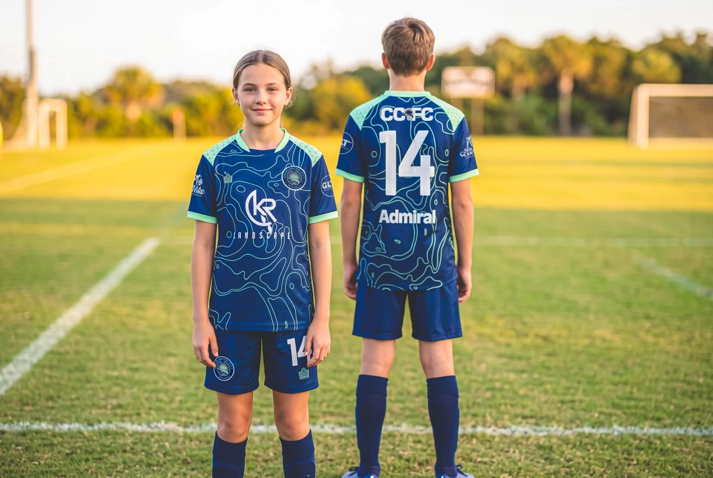
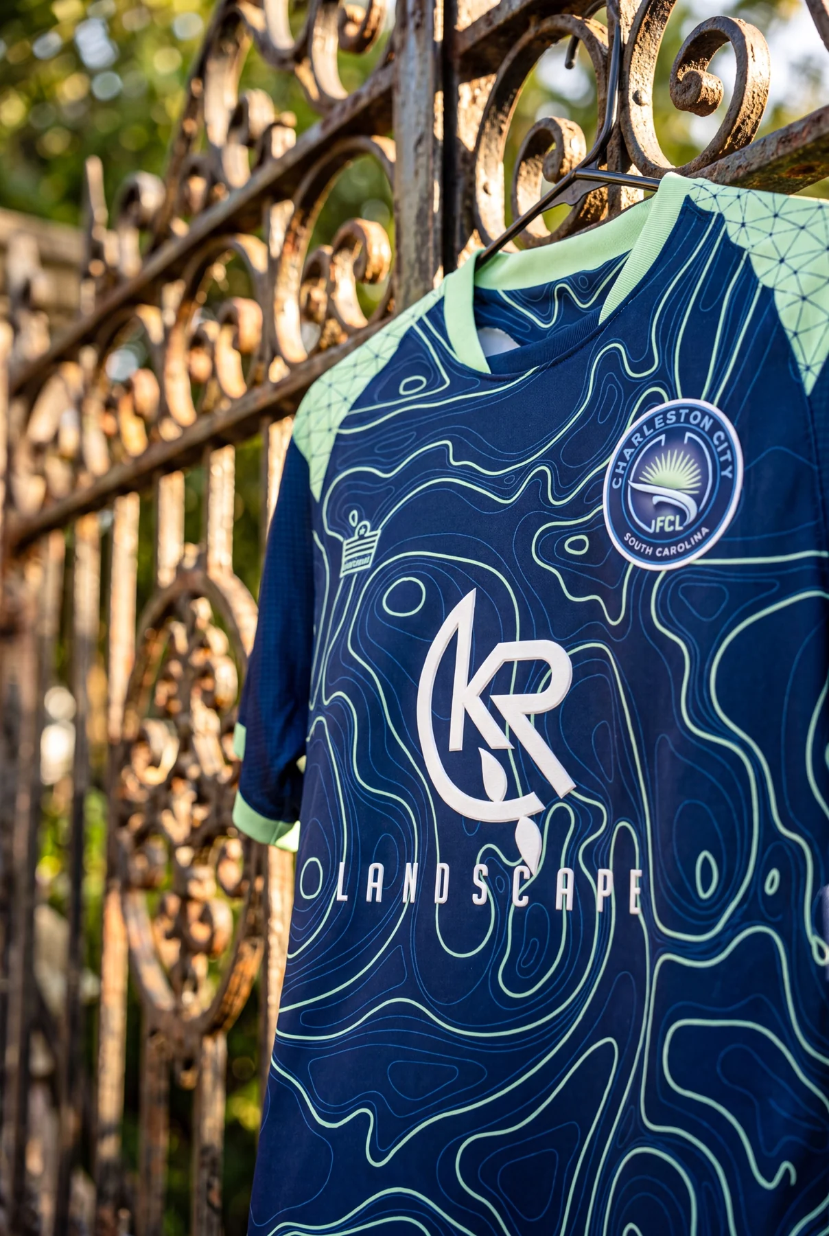
Flowing contour lines trace an abstract topographic rendering of Charleston Harbor. Across white and navy foundations, teal lines curve and converge like the city’s inlets, estuaries, and tidal channels.

A second pattern sits at the shoulders. The Power of Five links points into an expanding network, turning the mathematics of connection into a visual expression of the club’s reach through players, families, coaches, schools, and the wider Lowcountry.

Charleston City FC navy jersey showing the topographic pattern
“The topographic map tells the story of place. The Power of Five tells the story of people.”

Harbor light.
River depth.

Charleston City FC player wearing the white and teal home kit
01 · Home

White and teal

A bright white base carries light teal contours across the body, paired with teal shorts. From distance it is crisp and direct. Up close, it reveals a detailed portrait of the harbor.

Charleston City FC player wearing the navy away kit
02 · Away

Navy and teal

Deep navy recalls the Cooper River at dusk. Teal topographic lines rise from the darker base, giving the away kit a distinct identity that remains unmistakably Charleston.

Charleston City FC goalkeeper wearing the electric yellow kit
03 · Goalkeeper

Electric yellow.
Impossible to miss.

The goalkeeper kit gives the collection its boldest expression. An electric yellow base carries an orange halftone pattern across the body, while teal topographic lines bring Charleston’s river map onto the sleeves.

The matching shorts and socks complete a unified look for boys’ and girls’ goalkeepers. Navy numbering keeps every detail clear at distance.

Charleston City FC players in navy kits on the field

One club. One city. A story carried onto the pitch.

The river map moves off the pitch.

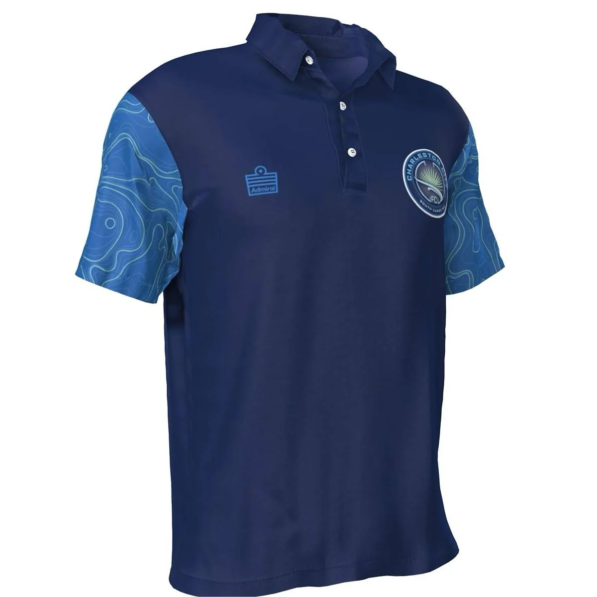
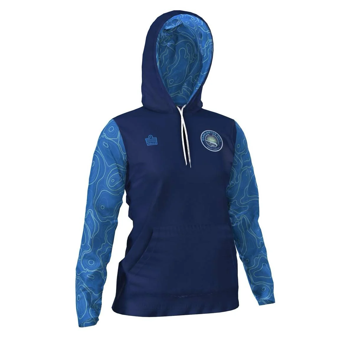
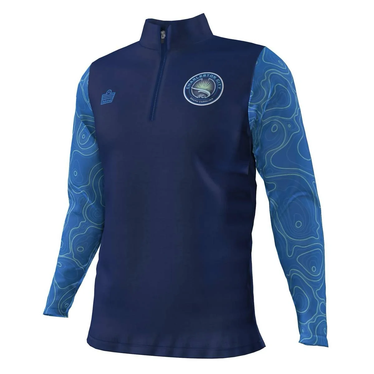
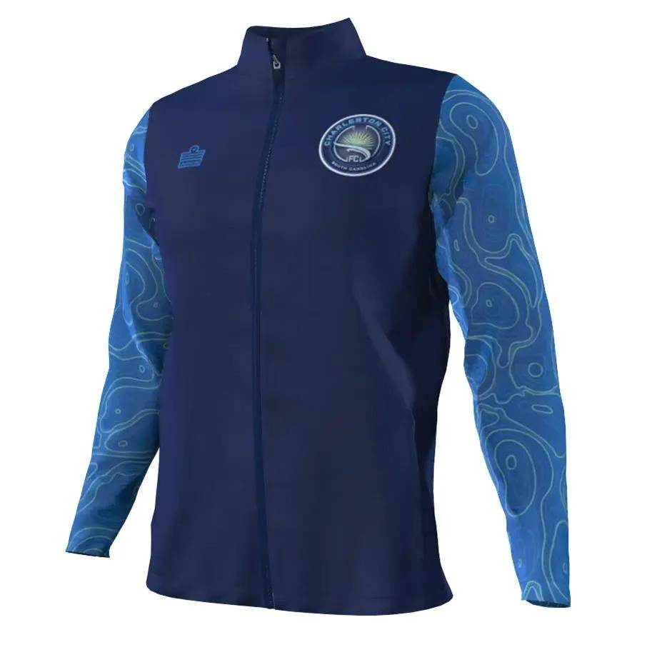
The same Charleston identity extends through training and everyday clubwear. Navy foundations, light blue sleeves, and teal contour lines keep the collection connected without turning every piece into the same garment.

Charleston City FC navy polo
Custom polo
Charleston City FC navy hoodie
Club hoodie
Charleston City FC navy quarter zip
Quarter zip
Charleston City FC navy full zip jacket
Full zip
Charleston City FC players wearing navy club training gear

Designed together.
Owned by the club.

Created through Admiral ID, the collection gave Charleston City FC’s leadership a live view of the design as it evolved. The team could refine the weight of the topographic lines, the density of the Power of Five network, and the balance of navy, white, light blue, and teal before production.

“Using Admiral ID, we worked side by side with the club to translate Charleston’s history and community network into a modern design that stands out on the pitch and means something off it.”
Paul Hamburger, CEO, Admiral Sports
Charleston City FC white and teal jersey in the Lowcountry landscape

From the harbor
to the pitch.

A collection made to look like the city its players represent.